LetzB
Designing an application that focuses on creating an innovative way for LGBTQ+ womxn to make connections through the events they attend.
| My Role | The Team | My Key Contributions | Tools Used | Timeline |
|---|---|---|---|---|
| UX/UI Designer | 3 Developers, UX/UI Designer, Project Manager & Myself | User Research, Interaction Designer, Usablity Testing, Prototyping, Product Designer, Product Owner | Adobe XD, InVision, Jira, Trello, Zeplin, Balsamiq, Adobe Creative Suite | 3 Months |
My Role
UX Designer
The Team
3 Developers, 1 UX/UI Designer, 1 Project Manager
My Key Contributions
User Research, Interaction Designer, Usablity Testing, Prototyping, Product Designer, Product Owner
Tools Used
Adobe XD, InVision, Jira, Trello, Zeplin, Balsamiq, Adobe Creative Suite
Timeline
3 Months
Timeline Breakdown

INTRO
LetzB
LetzB is a startup focused on creating an innovative way for LGBTQ womxn to make connections through the events they attend.
The Problem
The lesbian community is frustrated. There are an estimated 285,000 lesbians in New York City; however, there are only three lesbian bars. Womxn are unsatisfied with the LGBTQ+ dating apps out there and there is a lack of representation for the lesbian community. Other dating apps can be time consuming and unorganic. Apps such as Tinder, Bumble, etc. often fetishize the lesbian community in order to fulfill their fantasies.
"How can we design an application that enhances the user experience and create an innovative way for LGBTQ womxn to meet?"
Research + Key Insights
We conducted a Google survey to gain a better sense of the needs of the users. We received 230 responses, and these were some key findings we found:
- 80% of the users were not a fan of the hookup culture, and would prefer meaningful connections.
- 55% of users paid for an app subscription if it gave them all access.
- 65% of the users that join dating apps want to find a community.
Competitive Breakdown
 |
 |
 |
 |
 |
|
|---|---|---|---|---|---|
PROS |
|
|
|
|
|
CONS |
|
|
|
|
|

PROS
- Quick Swipes
- Lots of Users
- User Friendly
CONS
- 90% heterosexual men and women
- Too many fakes
- Flooded with guys

PROS
- Community
- Good for older women
- Unsatisfactory design
CONS
- Annoying notifications
- VIP is pricey
- App is glitchy

PROS
- Simple design
- User friendly
- Quick swipes
CONS
- Need Premium for most features
- Too many bugs
- Premium is pricey

PROS
- Simple design
- Good for one night stands
- Like Grindr for women
CONS
- Too many bugs
- Bad for deep connections
- Can't filter

PROS
- Sleek design
- Huge userbase
- Incorporates communities
CONS
- Unwanted VIP charges
- Fake profiles
- Still a ton of men
Targeted Users and Their Needs
Megan Zucker
GOALS
Meet cool people in the LGBTQ+ community.
FRUSTRATIONS
- Nervous to venture out into a lesbian environment alone.
- Prefers more organic ways to connect with people.
- Is very busy with work.
Megan Zucker
GOALS
Meet cool people in the LGBTQ+ community.
FRUSTRATIONS
- Nervous to venture out into a lesbian environment alone.
- Prefers more organic ways to connect with people.
- Is very busy with work.
Jennifer Lee
GOALS
Attend more LGBTQ+ events!
FRUSTRATIONS
- Other lesbian dating apps have too many scams.
- Too expensive to pay for the subscription.
- Other apps are very tedious.
Jennifer Lee
GOALS
Attend more LGBTQ+ events!
FRUSTRATIONS
- Other lesbian dating apps have too many scams.
- Too expensive to pay for the subscription.
- Other apps are very tedious.
Shannon Smith
GOALS
Needs fun ways to meet other lesbians.
FRUSTRATIONS
- Finds other dating apps really annoying.
- Sick of getting fetishized by other men and their fantasies.
- Hates being catfished.
Shannon Smith
GOALS
Needs fun ways to meet other lesbians.
FRUSTRATIONS
- Finds other dating apps really annoying.
- Sick of getting fetishized by other men and their fantasies.
- Hates being catfished.
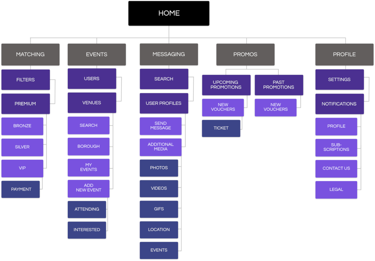
Organizing the Sitemap Prior to the UI
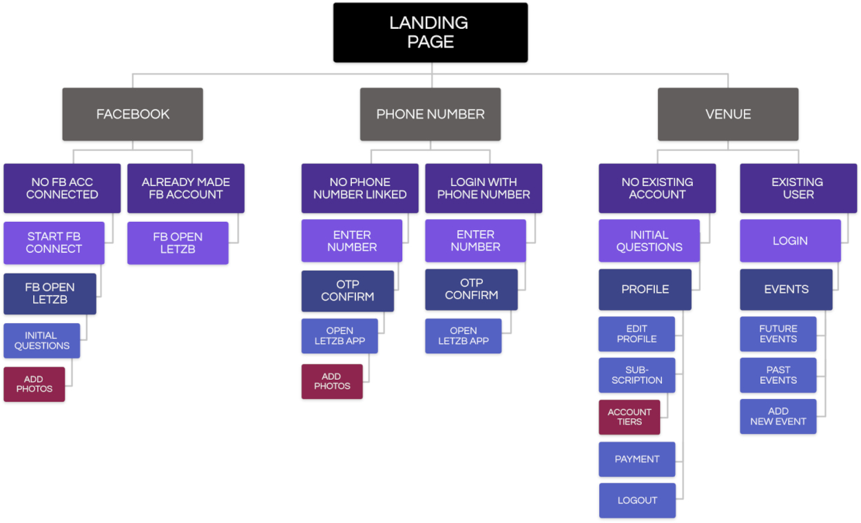
With the user insights and frustrations in mind, I created a site map for the app flow. I discussed it over with a project manager to also make sure that it made sense.
Branding
Logo
Icons
Colors
Font
Questrial
Questrial
Questrial
Questrial
Questrial
Signika
Signika
Signika
Signika
Signika
Ideation & Wireframing
Low Fidelity Wireframes
Once the site map was completed, I started working on the low fidelity wireframes using the low fidelity application, Balsamiq.
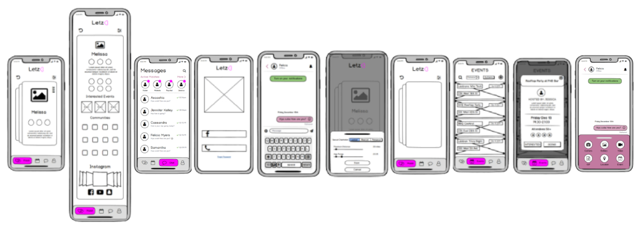

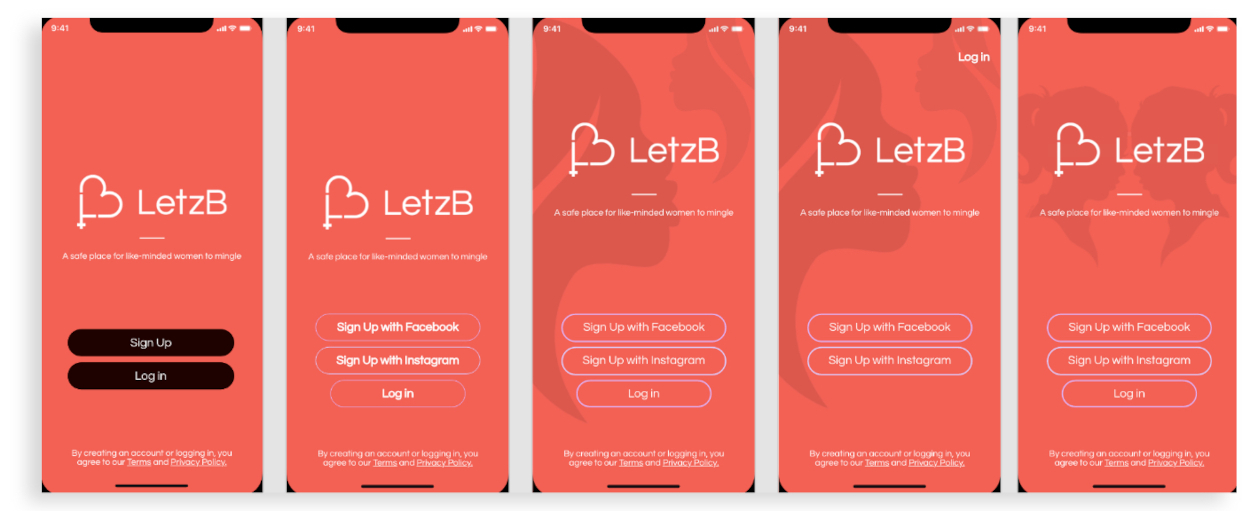
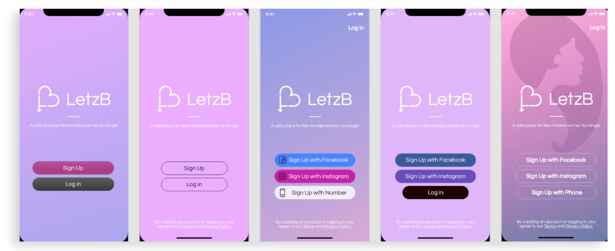
First Iteration Ideas
Designing a landing page was a little tricky at first, because initally, we had colors that followed the colors of the first logo. However, when we changed the color scheme, I had to change the entire landing page as well.
Finalized User Interface
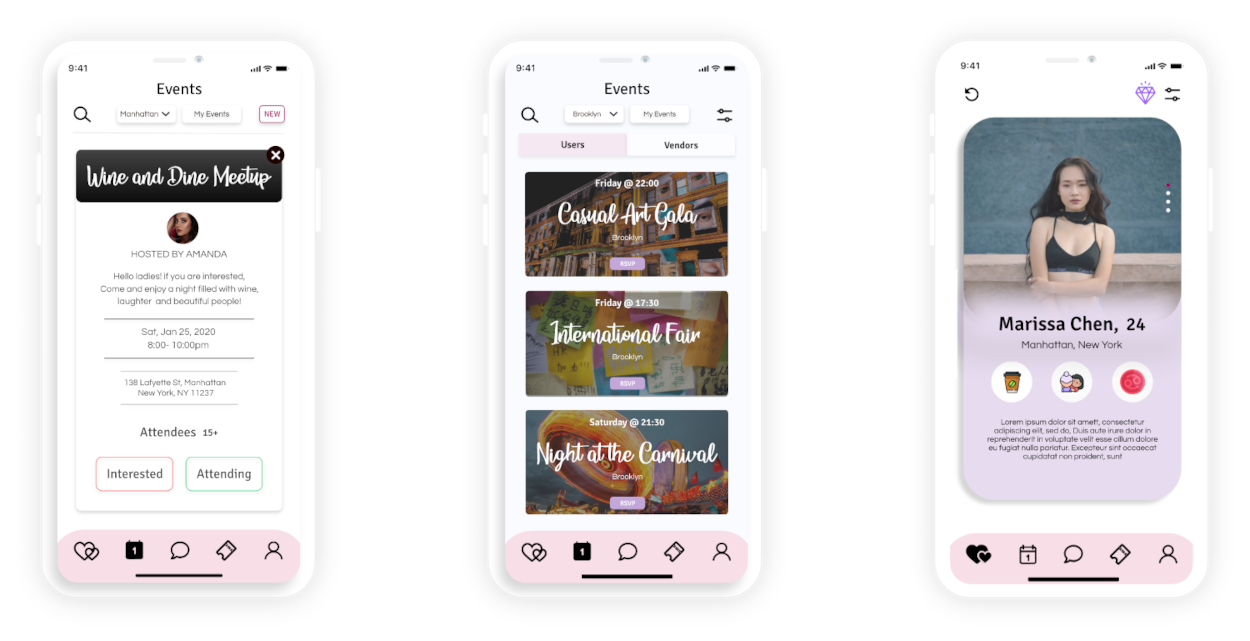
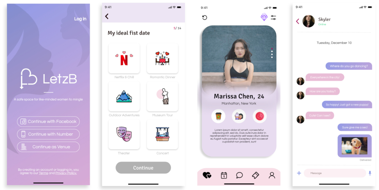
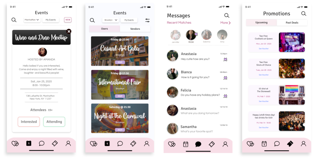
Here is a brief overview as to what the final designs looked like!
App Highlights
Shortening the Onboarding Process
- Traditional dating apps contain a very monotomous set-up process with too much writing! We sped up the process by representing icons as answers.
- Highlighted answers clearly show the user which answers they chose.
- Upper right hand number indicates which question user is on.
Getting Matches
- Steers away from traditional boring "like" and "dislike" buttons.
- Easily access quick filters to find who you are looking for.
- Quickly glance and see if the person matches what user is searching for from their featured icons!
Ticket Vouchers
- Clear user flow allows users to view their vouchers with ease.
- Easily allows users to navigate through present and past vouchers.
- Save tickets directly to your Apple Wallet!
Increasing the Number of Organic Engagements via "Events"
- Clear user flow allows users to quickly create and find new events!
- Easily allows users to find new LGBTQ+ events to attend.
- Adding an events section increases the chance of organic connections.
RESULTS
Thoughts From the Community
Here are some things that were mentioned after showing the community the prototype!
"Ahhh! Looks Amazing!"
"Love The Design!"
"Finally an App That Understands Our Needs"
"When Is It Launching!"
"Can't Wait"
"Love the Colors!"
"I Love That This App Has Events as Well!"
"Move Over HER!"
"Love The Name"
"I Would Definitely Pay For This App!"
"FINALLY"
"I love the Rose Aspect"
"Icons are SO CUTE"
"Love The Flow!"
"Questions are So Much Fun!"
"Ahhh! Looks Amazing!"
"Love The Design!"
"Finally an App That Understands Our Needs"
"When Is It Launching!"
"Can't Wait"
"Love the Colors!"
"I Love That This App Has Events as Well!"
"Move Over HER!"
"Love The Name"
"I Would Definitely Pay For This App!"
"FINALLY"
"I love the Rose Aspect"
"Icons are SO CUTE"
"Love The Flow!"
What I Learned
- The importance of including a sitemap prior to starting low fidelity wireframe designs.
- The importance of doing A/B testing after the first iteration of the wireframes!
- In small startup companies, employees might have to take on additional roles to help each other out!
Final Words
I am very happy at the work that I was able to deliver with the short time frame that was given. Initially, I was so nervous when designing this app, because I wanted the users to love it! I wanted to create a design that would enhance the user experience and encourage users to stay on the app for long periods! However, I was relieved when I received positive reviews on it! I am so grateful for this opportunity and can't wait to tackle my next project and make it even better!
NEXT UP
MetricZoom
Empowering a lead generation marketplace website and application to successfully launch in both the Apple and Google Play store!
