MetricZoom
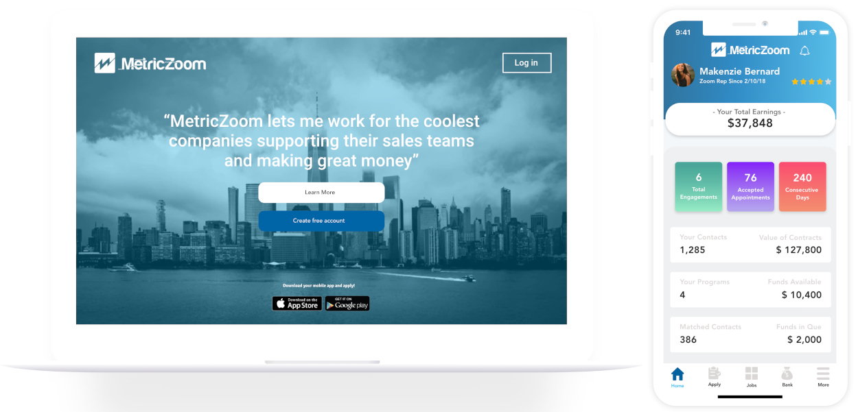
Empowering a lead generation market place website and application to successfully launch in both the Apple and Google Play store!
My Role
Product Designer and Project Lead
The Team
3 Developers, 1 CEO, 1 Project Manager & My self
My Key Contributions
Product Designer, UX Researcher, Iconography, Interaction Design Developer Handoff, UI Designer Brand Creation.
Tools Used
Sketch, Adobe XD, InVision, Zeplin, Photoshop & Illustrator
Timeline
6 Months
July 2019 - Dec 2019
Timeline Breakdown
INTRO
MetricZoom
MetricZoom is the first application that connects companies requring b2b sales appointments with a talented on-demand workforce. Our Freelance Marketplace helps companies hire the most qualified talent for scheduling sales appointments, on a pay for performance basis. Using MetricZoom companies can efficiently scale sales generation campaigns and track successes through an integrated CRM interface.
Design Opportunity
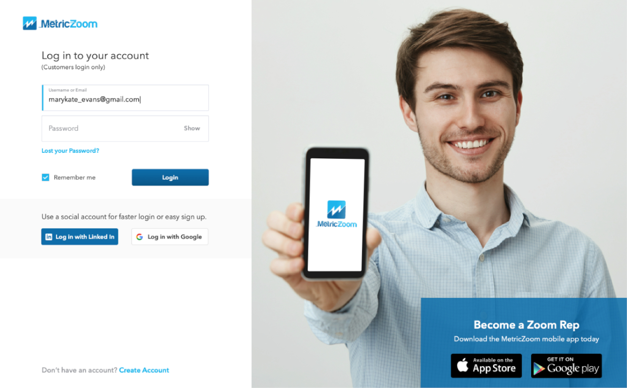
When we began, MetricZoom already had the basic UI layout for some of the screens. The CEO originally did not want to hire a UX/UI designer to create the envisioned screens from his PowerPoint, and wanted the developers to try and code it from a PDF.
The Problem
The CEO realized that he needed a UX/UI Designer to come in and help him with some designs, and to create his envisioned product from PDF to a pixel perfect wireframe file.
"How can we tweak the CEO's previous design to enhance the user experience and get the product launched in the Apple and Google Play Stores?"
Branding
Logo
Icons
Colors
Font
Avenir LT Std
Avenir LT Std
Avenir LT Std
Avenir LT Std
Avenir LT Std
REVIEWING PDF OF OLD VERSIONS
Old User Interfaces of Web & Mobile
A Very cramped. There isn't much space between each screen, and there isn't consistency among screens. Some parts were also illegible.
B Increased font size, color more vibrant.
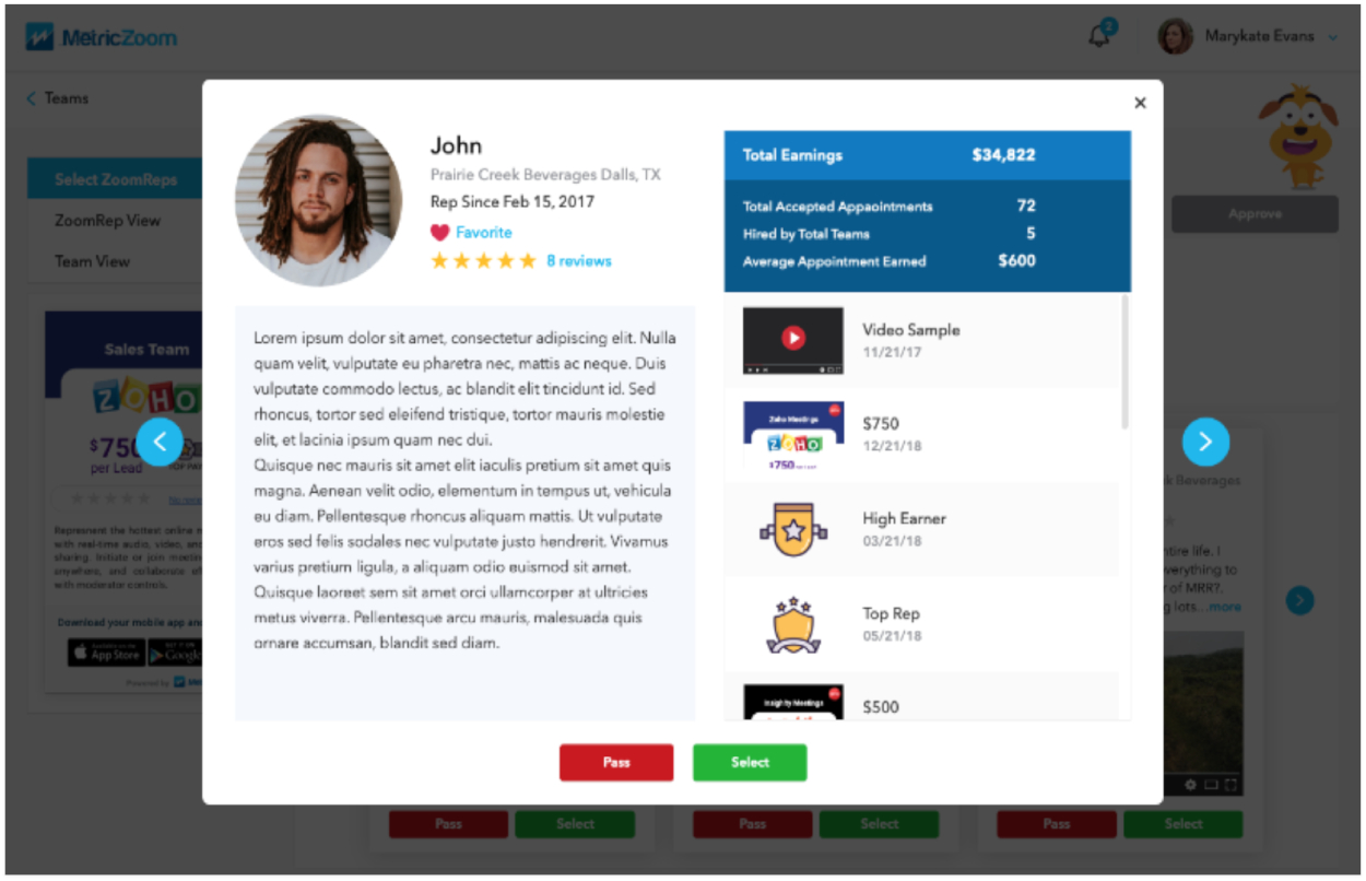
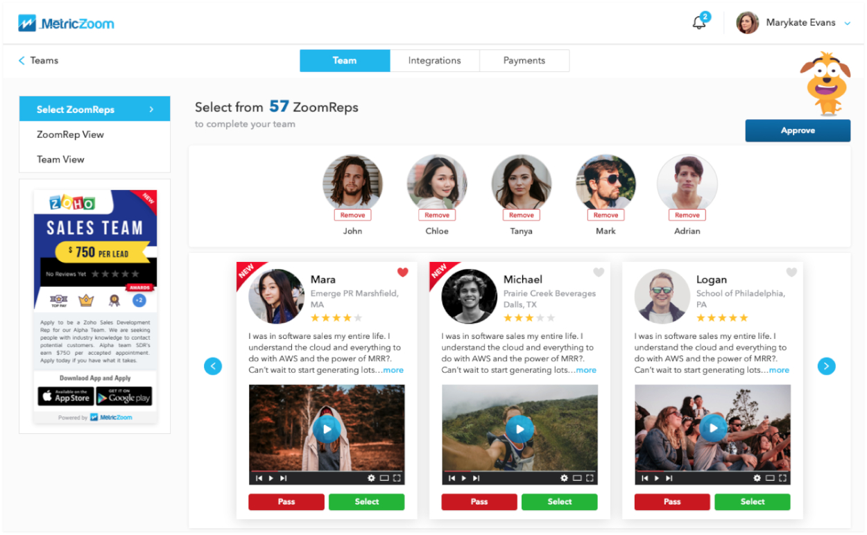
C Cramped, some places needed more white space, and other places were not needed.
D Icons are difficult to comprehend, excess images and excess sections!
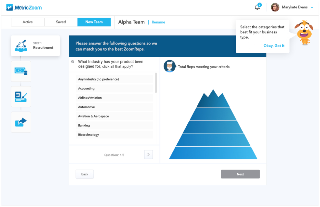
E Cramped, some places needed more white space.
F Too many unnecessary sections! Need to shorten the onboarding process.
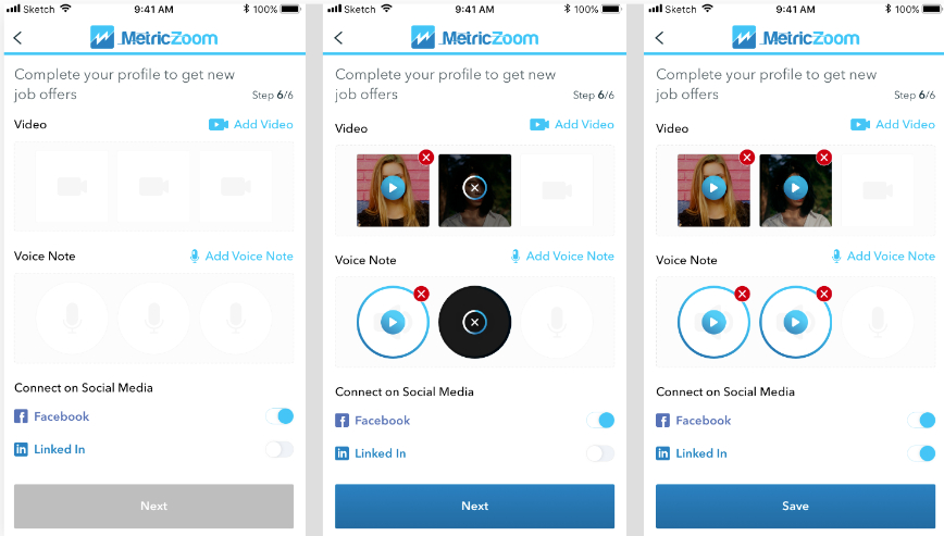
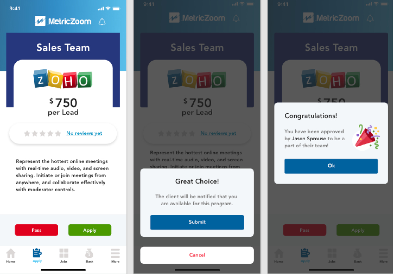
G Everything feels too cramped. There is not enough white space. Logos don't work so well with the entire screen.
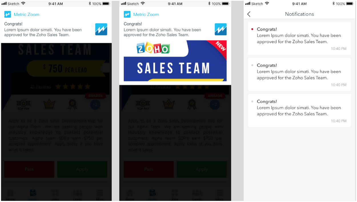
H Notifications can be displayed better.
REDESIGN
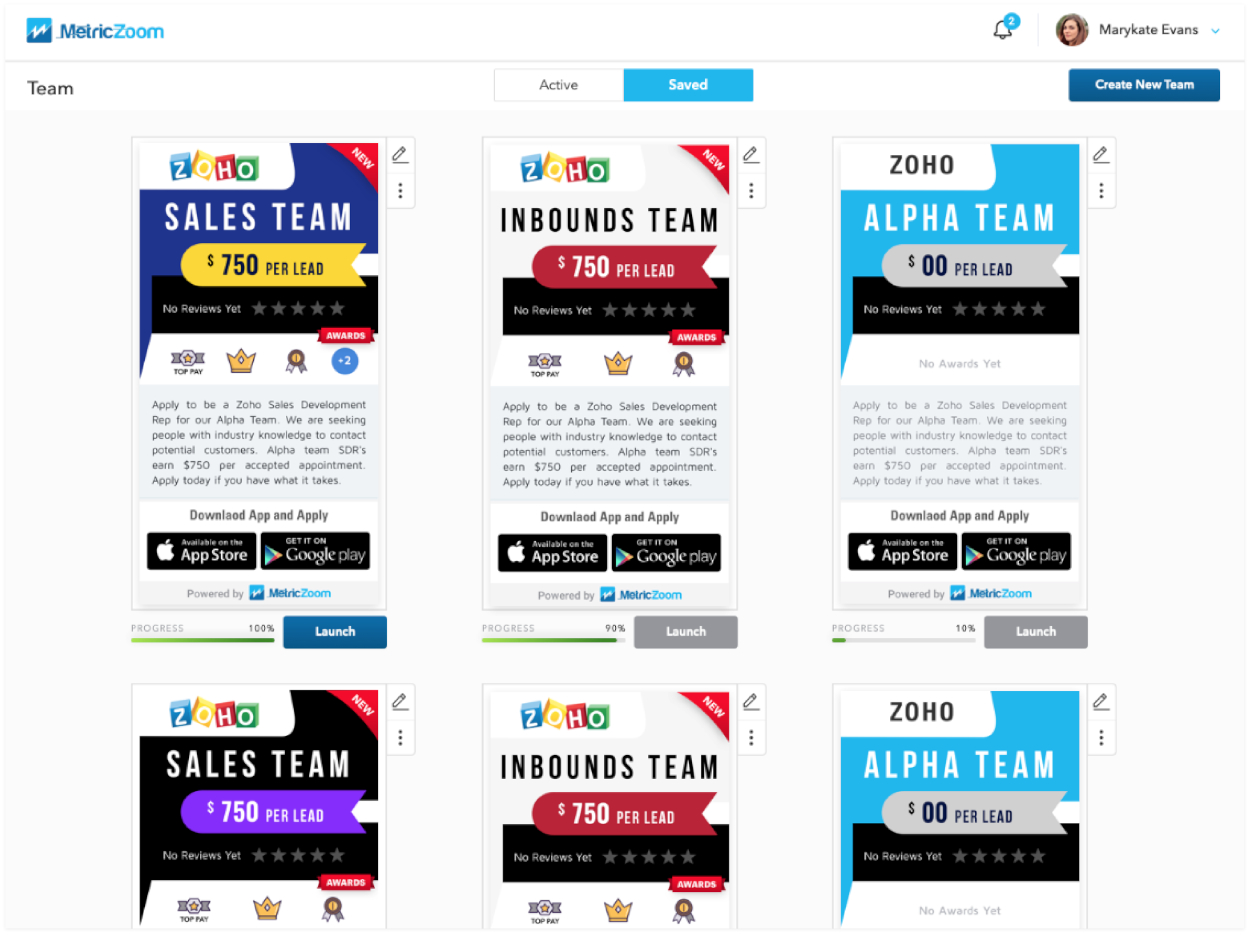
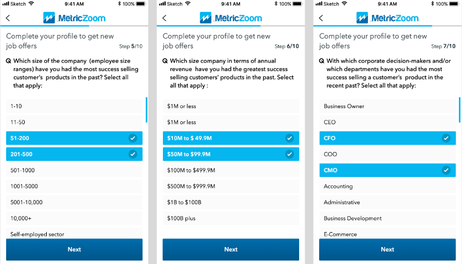
New Web and Mobile User Interfaces
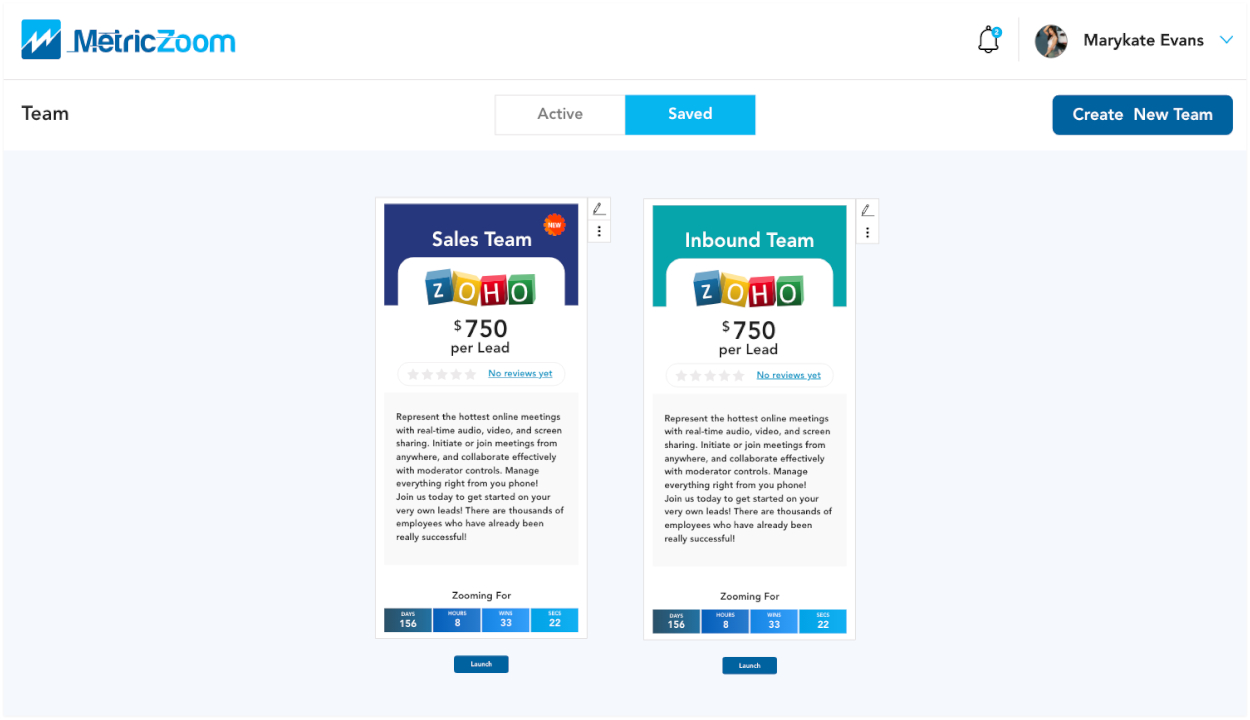
A Increased space enhances screen legibility, enhances user experience!
B Changed Logos, enhancing colors and cleaned up old user interface.
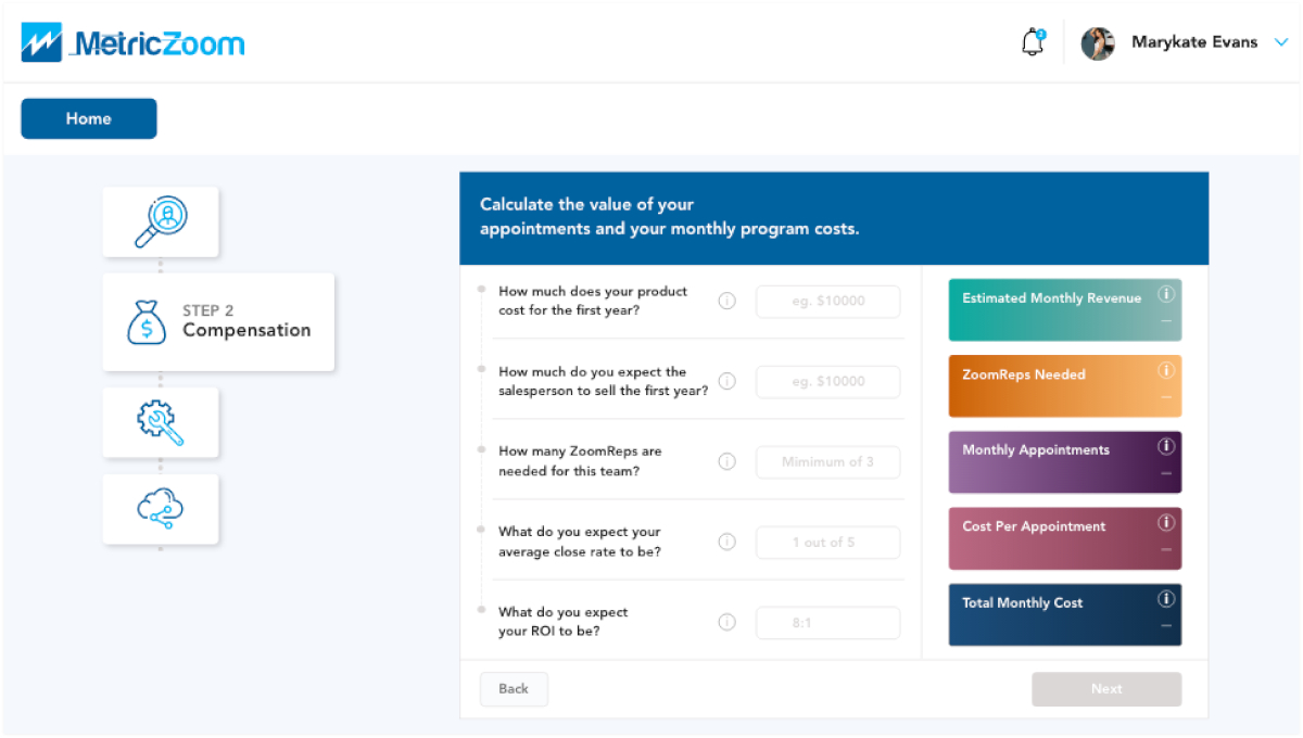
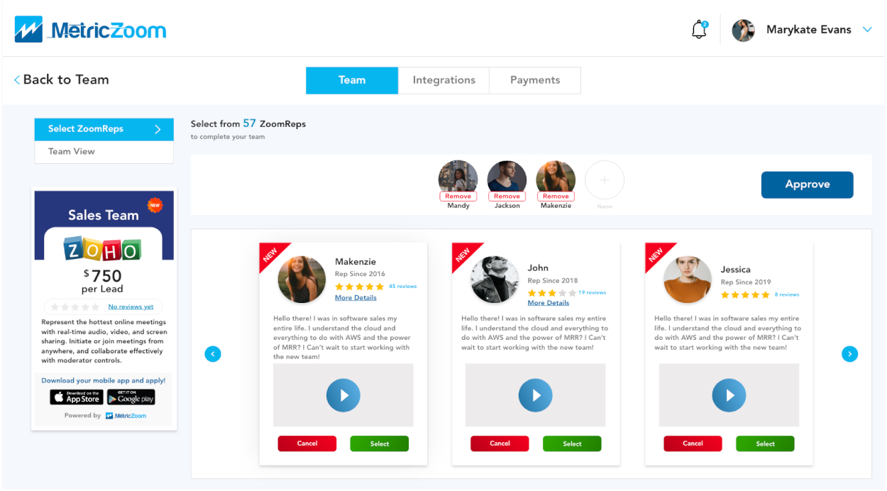
C Cramped, some places needed more white space, and other places were not needed.
D Icons are difficult to comprehend, excess images and excess sections!
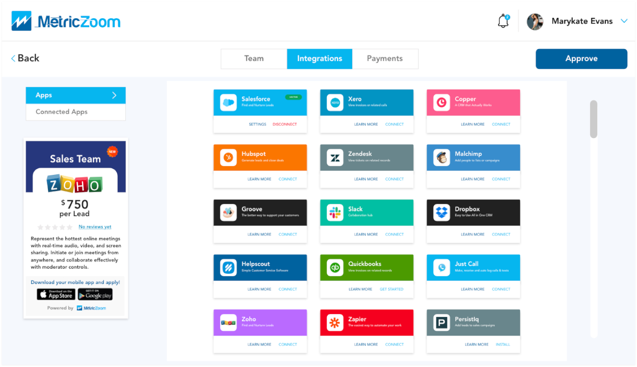
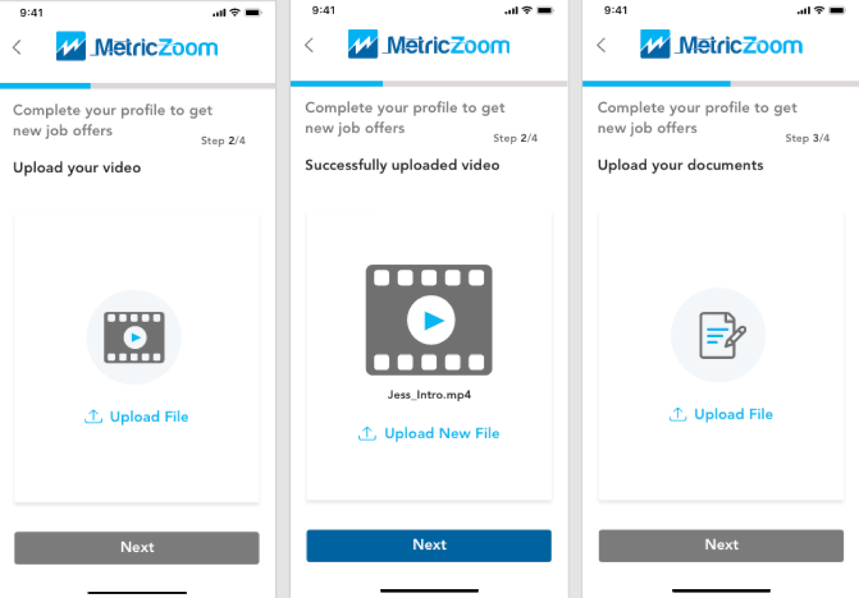
E Sleek new design makes it easier for users to complete their onboarding process with ease.
F Onboarding process simplified making the user experience better!
RESULTS
Key Results from the Changes
- App launched in the Apple and Google Play stores!
- Increased user interaction and customer satisfaction by 30%.
- Received over $100k in funding from investors!
What Have I Learned?
- Due to the short length of the project, it's a good idea to create a visual timeline for personal use to stay ahead of the project!
- The importance of the PM confirming with the CEO to finalize designs prior to designing high fidelity wireframes.
Final Words
Although I was not given that much creative freedom and faced some managerial issues, I am very proud that my team and I were able to get everything finished in a short period! Furthermore, I am also ecstatic of the fact that we were able to launch not only in the Apple App Store, but the Google Play Store as well! Initially, I was so nervous when designing this app, because I want users to like it. I wanted them to not only love the functionality but also want to stay on the app for long periods becaue they also enjoy the aesthetics! However, I was relieved when I received positive reviews on it! I am so grateful for this opportunity and can't wait to tackle my next project and make it even better!
NEXT UP
Radiate
Radiate is the first application that connects people who go to the same music events!
I worked with Radiate as their UX/UI designer, and social media manager. In this role, I helped establish their brand identity, and crafting end-to-end user experience mobile application, as well as social media marketing!
