ASAP+/ConnectPlus
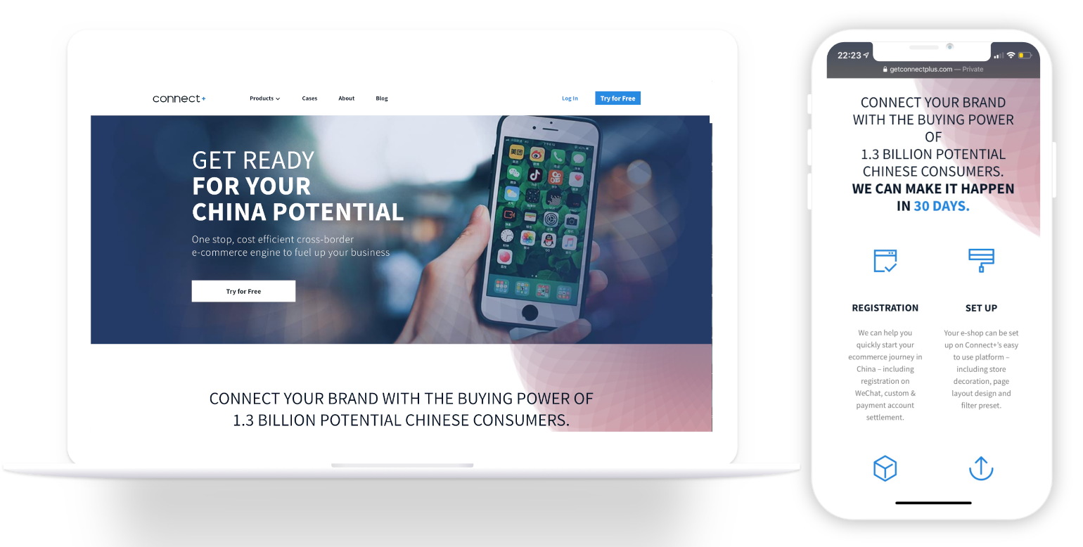
ConnectPlus helps brands that wish to expand their business into China's digital market by providing an omni-directional solution to approach and engage with their target audiences.
| My Role | The Team | My Key Contributions | Tools Used | Timeline |
|---|---|---|---|---|
| UX Designer | 4 Designers, 3 Project Managers, 1 Marketing Manager, 1 CEO, 12 Developers | UX Designer, Website Design, Translate Languages | Sketch, Ianhua, Jira, Adobe Creative Suite, Balsamiq, WeChat | 5 Months Feb 2019 - Jul 2019 |
My Role
UX Designer
The Team
4 Designers, 3 Project Managers, 1 Marketing Manager, 1 CEO, 12 Developers
My Key Contributions
UX Designer, Website Design, Translate Languages
Tools Used
Sketch, Ianhua, Jira, Adobe Creative Suite, Balsamiq, WeChat
Timeline
4 Months
May 2018 - August 2018
Timeline Breakdown

INTRO
What is ASAP+/ConnectPlus all about?
Connect Plus helps brands that wish to expand their business into China's digital market by providing an omni-directional solution to approach and engage with their target audiences. We provide end-to-end cross border eCommerce services across the main social commerce channels, including WeChat, Tik Tok and Tmall. In doing this, we help you connect to your potential customers seamlessly at anytime, anywhere.
Design Opportunity
I had the honor of working for their prominent parent company ASAP+, located in Shanghai, China during my Capstone study abroad there. As I worked here, I was transferred to working on their startup company Connect+ and helped them with various tasks including revamping their entire website, tweaking user interfaces for some clients.
ConnectPlus Goals
"How can we design an application that provides a simple and intuitive way for companies to market to Chinese consumers?"
The Problem
The CEO was not completely satisfied with the current website and felt like it needed something more. Since it was a startup, they needed as much help as they could get, and there was only a short time period to get this app completed and launched!
Branding
Logo
Colors
Font
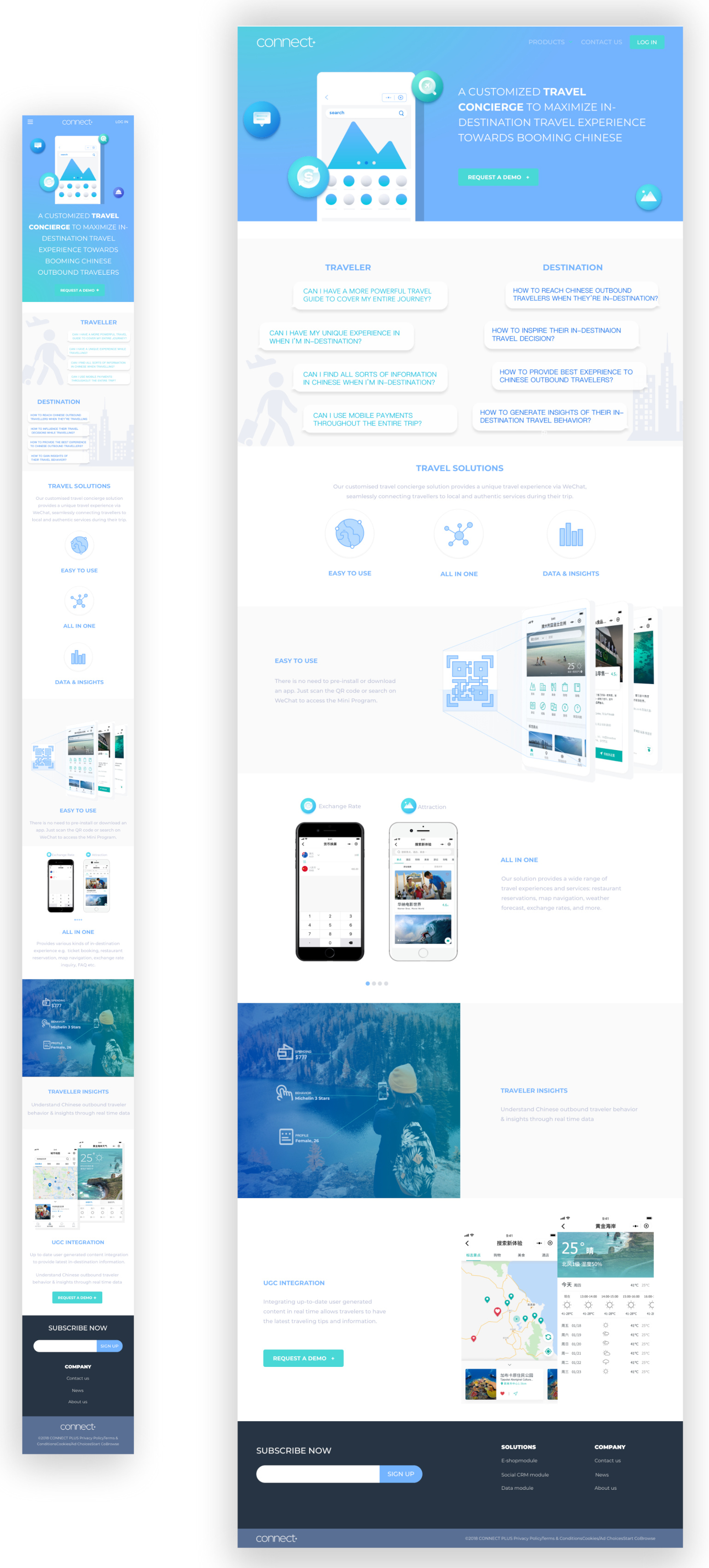
REVIEWING OLD DESIGNS
Old User Interfaces of Web & Mobile
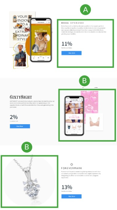
A A bit too small, illegible.
B Hard to read, colors don't stand out.
C Section not needed.
A Increased size so its more legible.
B Increased font size, color more vibrant.
C More organized, added a "learn more" button.
A A bit too small, illegible.
B Breaks it down, but confusing.
C Interesting idea, but makes users do an additional step by scanning QR code.
A Increased size so its more legible.
B Gives summary of what C+ does.
C Briefcase showcases clientele for testimonials.
A Font is too small, color is not vibrant.
B Some users still might find it difficult to understand the program.
A Increased font sizes and colors.
B One-minute video clearly depicts the program and its features.
A Images might be confusing.
B Font and colors are difficult to read.
A Font and color vibrancy increased, also highlights important details.
B Images represent the website much better.
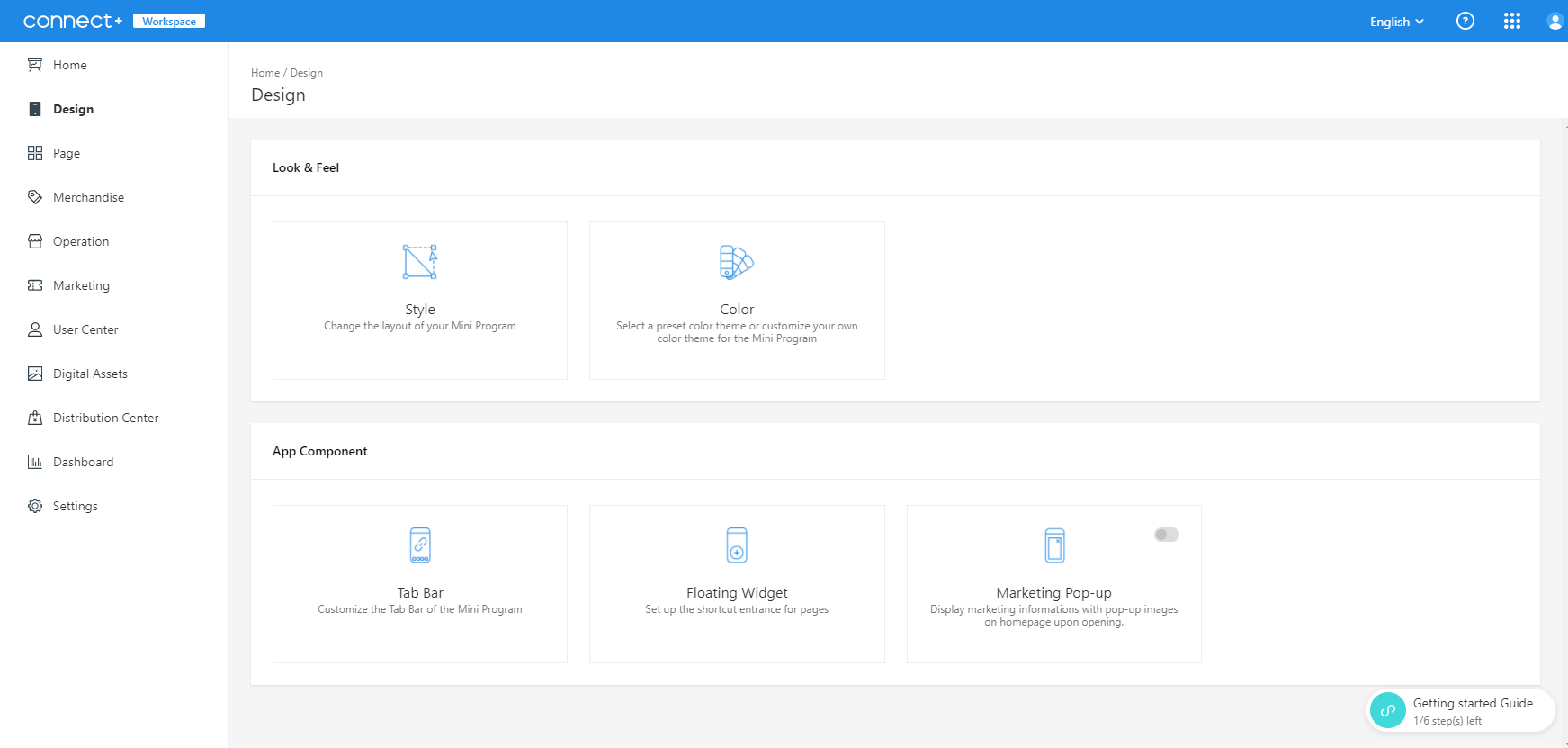
BEGINNING THE DESIGN OF THE CONNECT PLUS PRODUCT
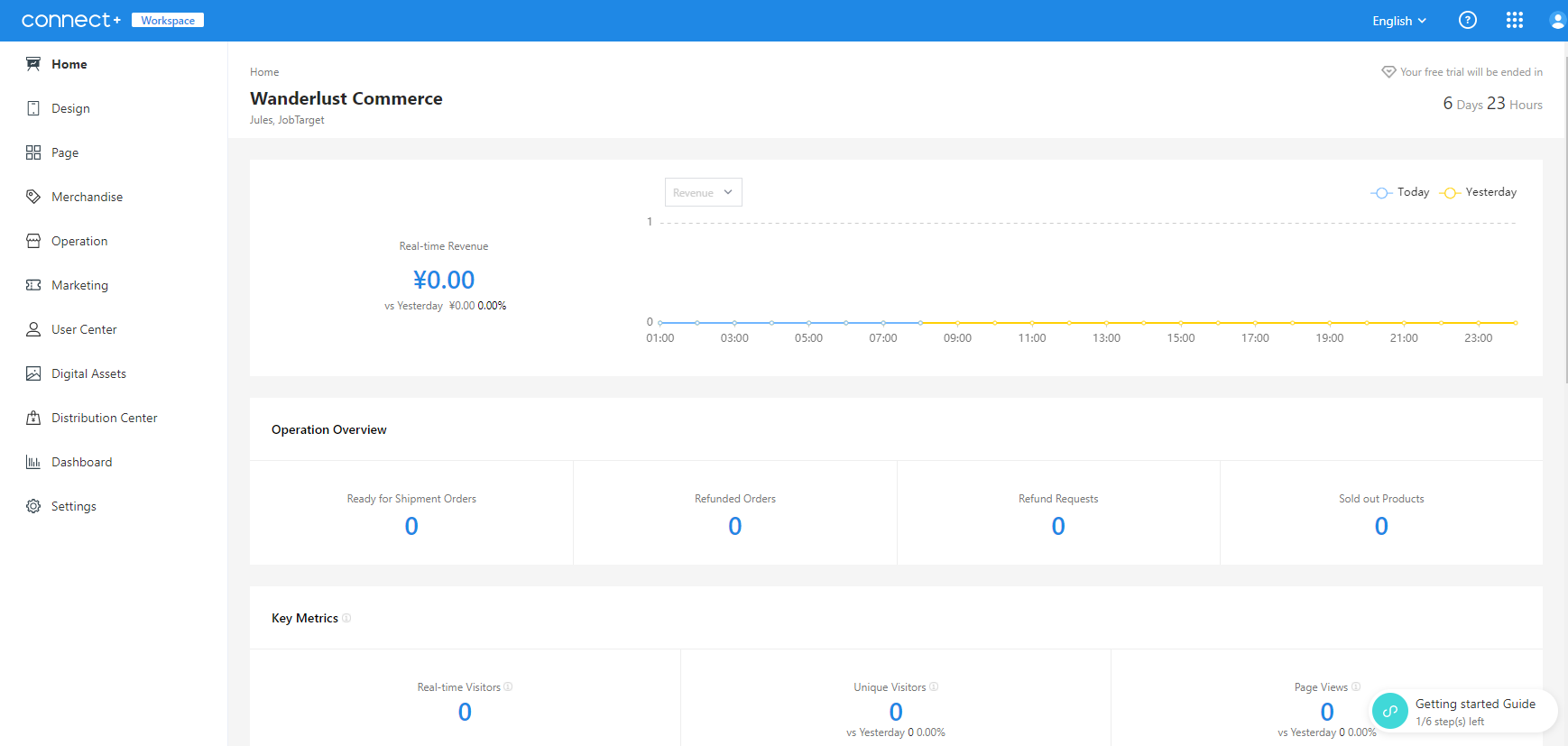
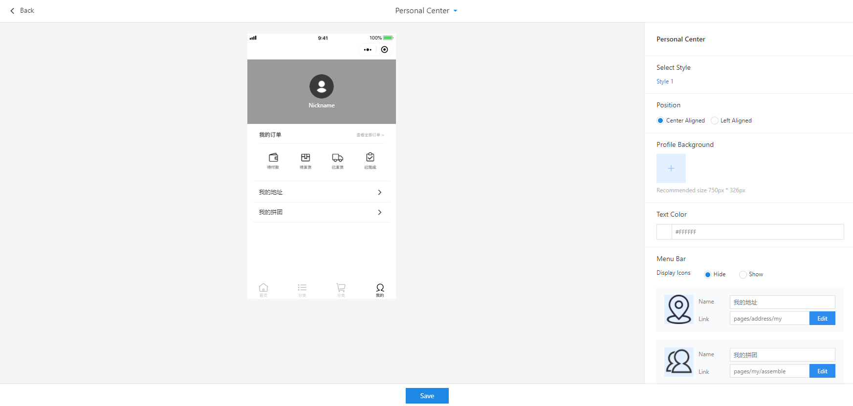
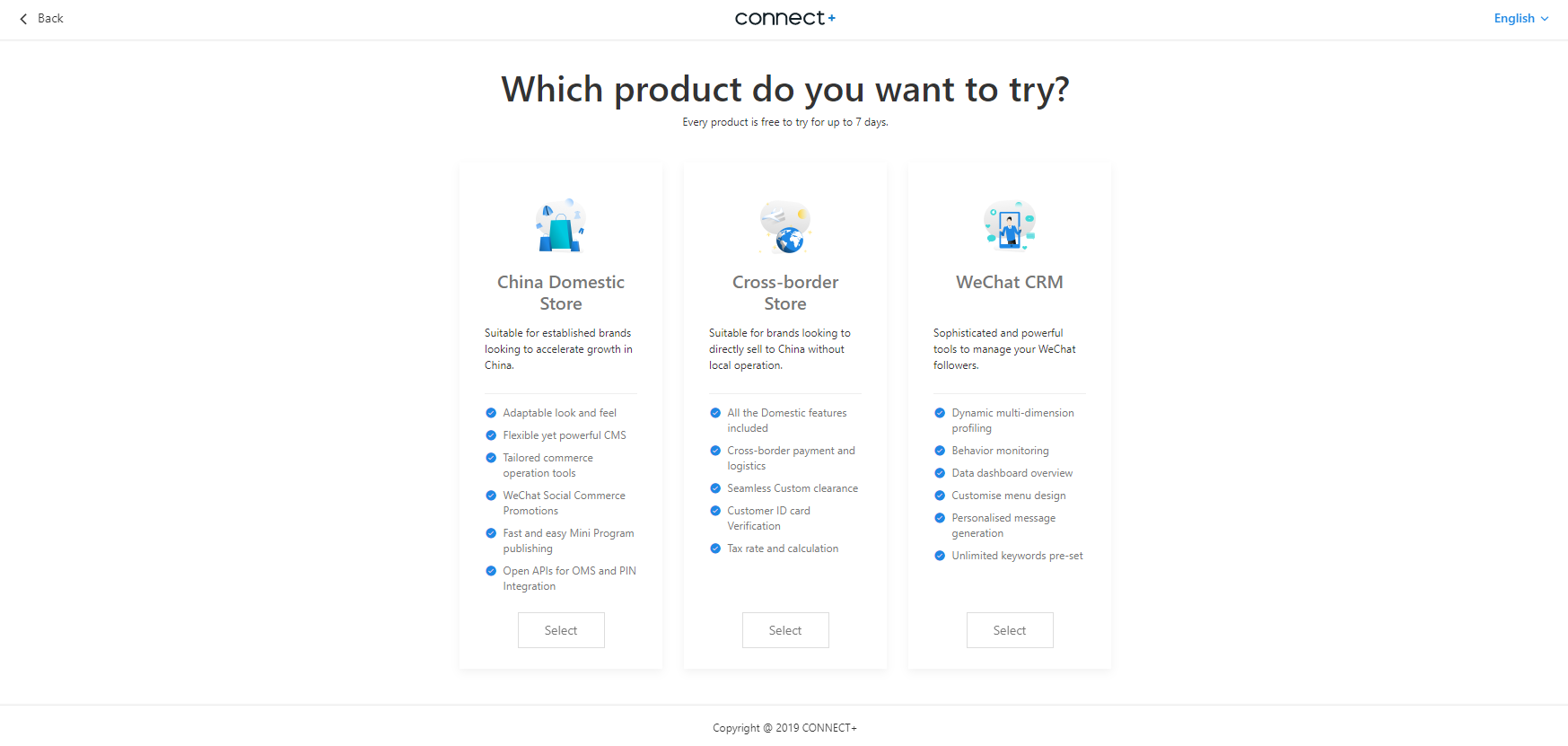
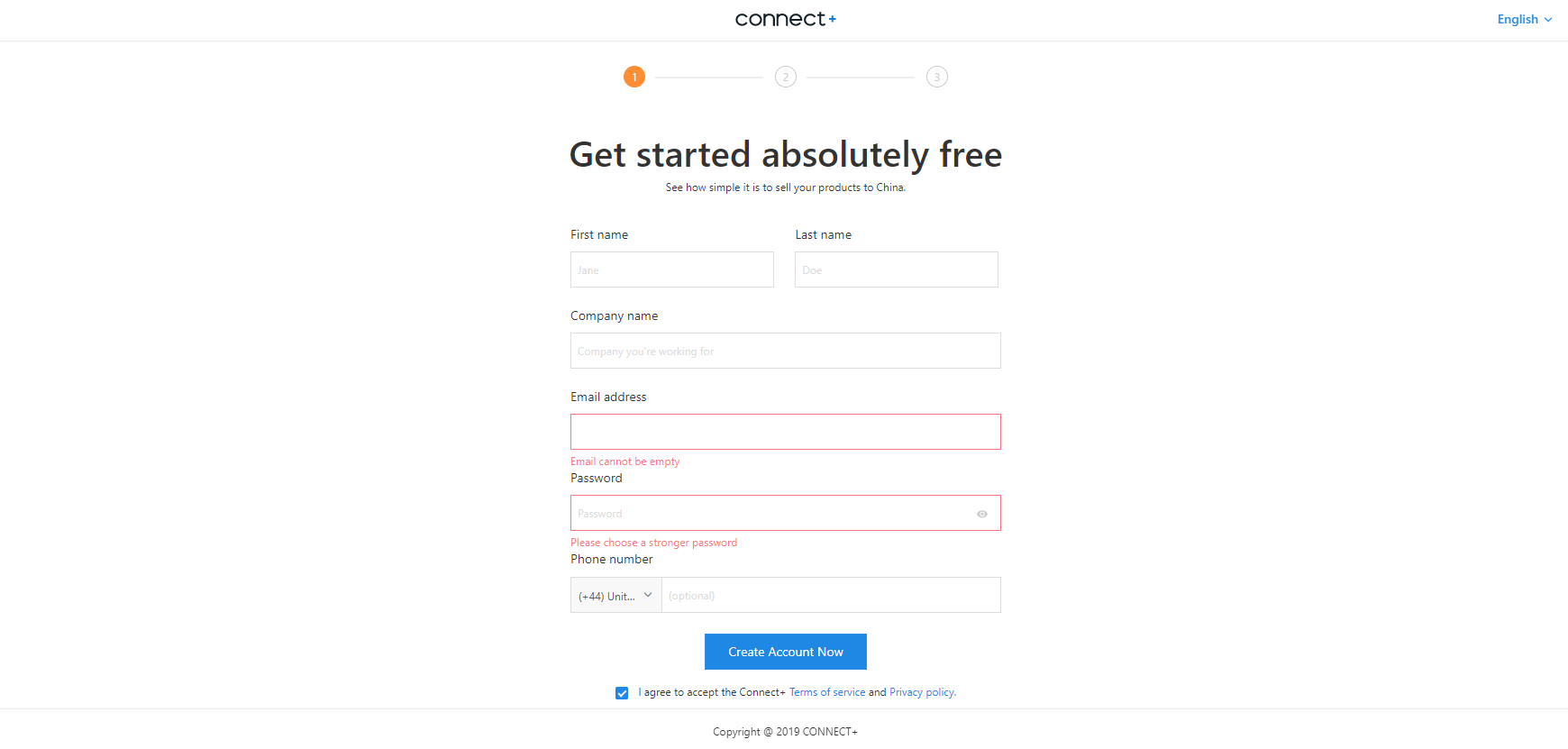
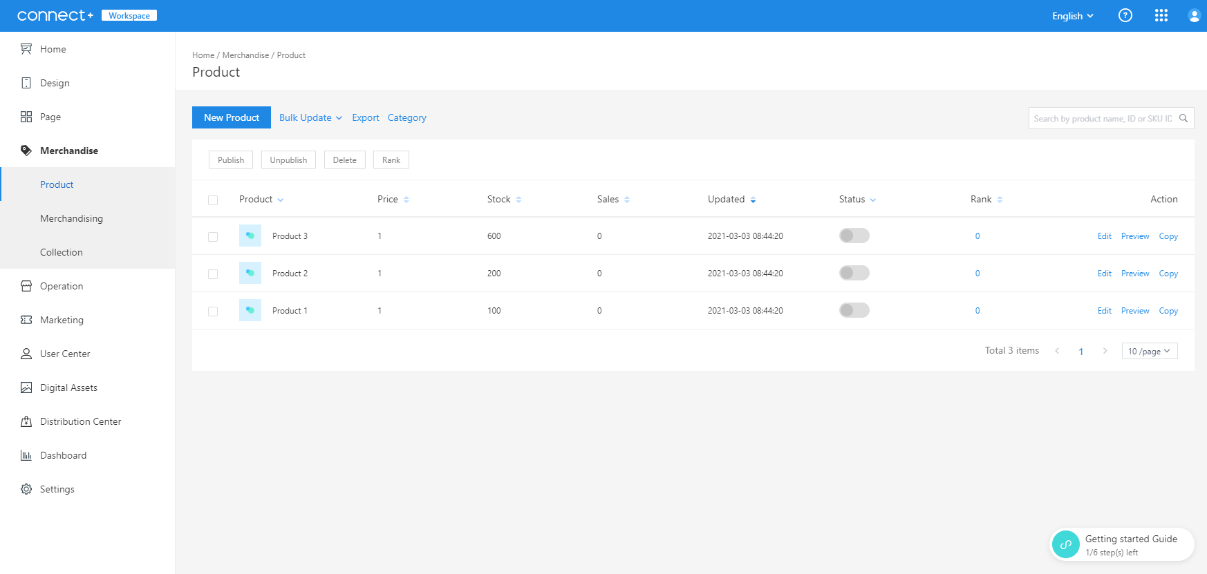
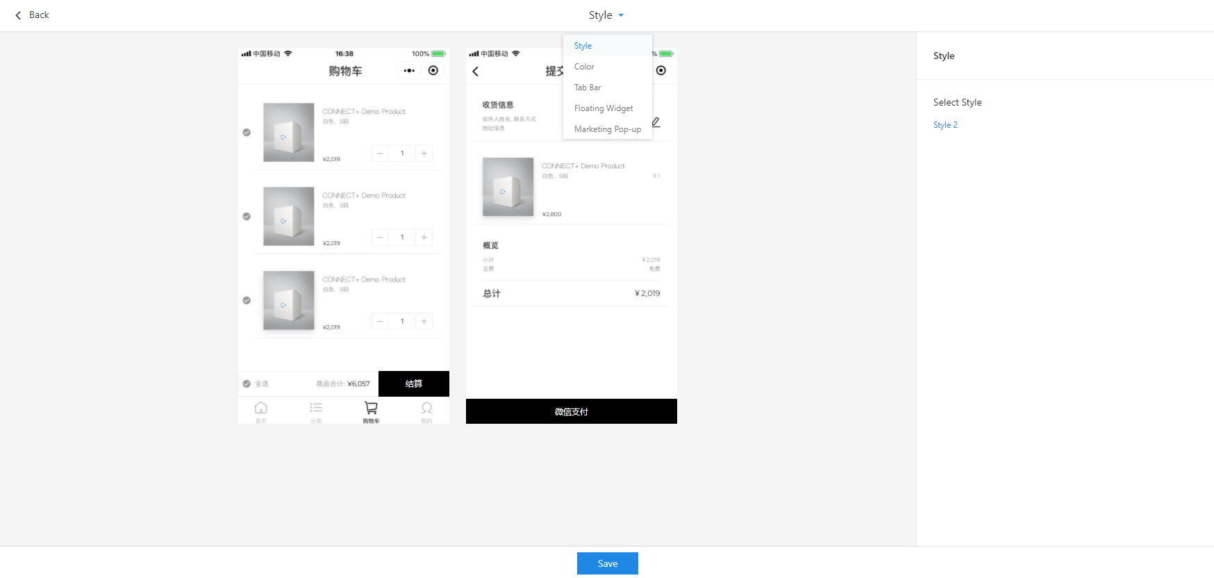
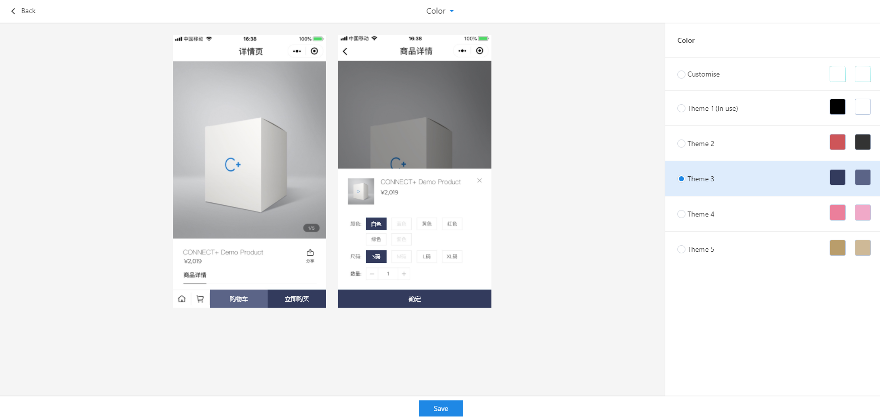
Low Fidelity Wireframes in Balsamiq
RESULTS
Key Results from the Changes
- Won the Shanghai SHIAF awards for design 2019.
- Clients satisfied with their launch on WeChat mini-programs including GOAT and Sneaker.
- Crafted company marketing and fundraising decks which helped ¥200k.
What Have I Learned?
- The different work styles in China compared to the Western Hemisphere.
- The importance of adding components and stylesheets to projects.
- Even if a task assigned might seem tedious and unimportant, it can make a huge difference in the long run!
Final Words
I feel so lucky to have had this opportunity! Working abroad in China has helped me broaden my mind and also helped me acquire new knowledge! I am so glad to be part of a wonderful team full of intelligent, funny and humble people. I am also so proud of the fact that we were able to work with various clientele from well-known companies! I can't wait to see how they grow in the future, and I'll be looking forward to my next project!
NEXT UP
LetzB
Designing an application that focuses on creating an innovative way for LGBTQ womxn to make connections through the events they attend.
I worked with LetzB as their only product designer, establishing their brand identity and crafting end-to-end user experience for their website and mobile applications! We were able to achieve over 95% positive ratings for the interactive prototype that was shown toward our target audience!